goConfirm
The anti-fraud software for consumers
Once we decided to wind down Benji Tax, I slowly started applying for jobs at companies where I felt I could make an impact while having the ability to refine my craft. One day, I randomly got a message from Raine Qian, who I previously reported to at Tulip. She mentioned there's an opportunity to lead design at goConfirm and she wanted to see if I would be interested.
Initially, I was a bit hesitant since I had worked on Benji for six years and failed to turn it into a VC-backable business. I wasn't sure if I wanted to go work at yet another early-stage startup that might shutdown a year later. Nonetheless, I decided to learn about the opportunity since Raine mentioned it had been her favourite job to date.
After chatting with each member of the founding team, I decided to accept the role since I found it to be an interesting problem in a familiar-ish space while knowing there's sufficient runaway to continue experimenting our way to product-market fit.
Head of Design
Jul 2024–Sep 2025
My role as the Head of Design at goConfirm has been probably one of my most craft-challenging and over-encompassing to date. I think it's likely also why it was one of my favourite jobs to date.
I had the privilege to direct design across mobile apps, websites, and marketing channels. I partnered with engineering, product, and support to reposition goConfirm as an anti-fraud software. I created and maintained a design system to help accelerate product development.
By the end, we grew to 70,000+ users in the first year.
Feature Launch Video
I created this video with feedback from the goConfirm team. This was my first attempt at creating an feature launch video. Typically, I've used Jitter for creating short animations for website sections and in-app explainer screens. Plenty of room for improvement.
Steps for producing this video:
- Drafted a script using the AIDA principle
- Created a storyboard in Figma to get team buy-in
- Animated all designs in Jitter
- Generated the voiceover in Wondercraft
- Assembled the animations, voiceover, background music, and sound effects in DaVinci Resolve
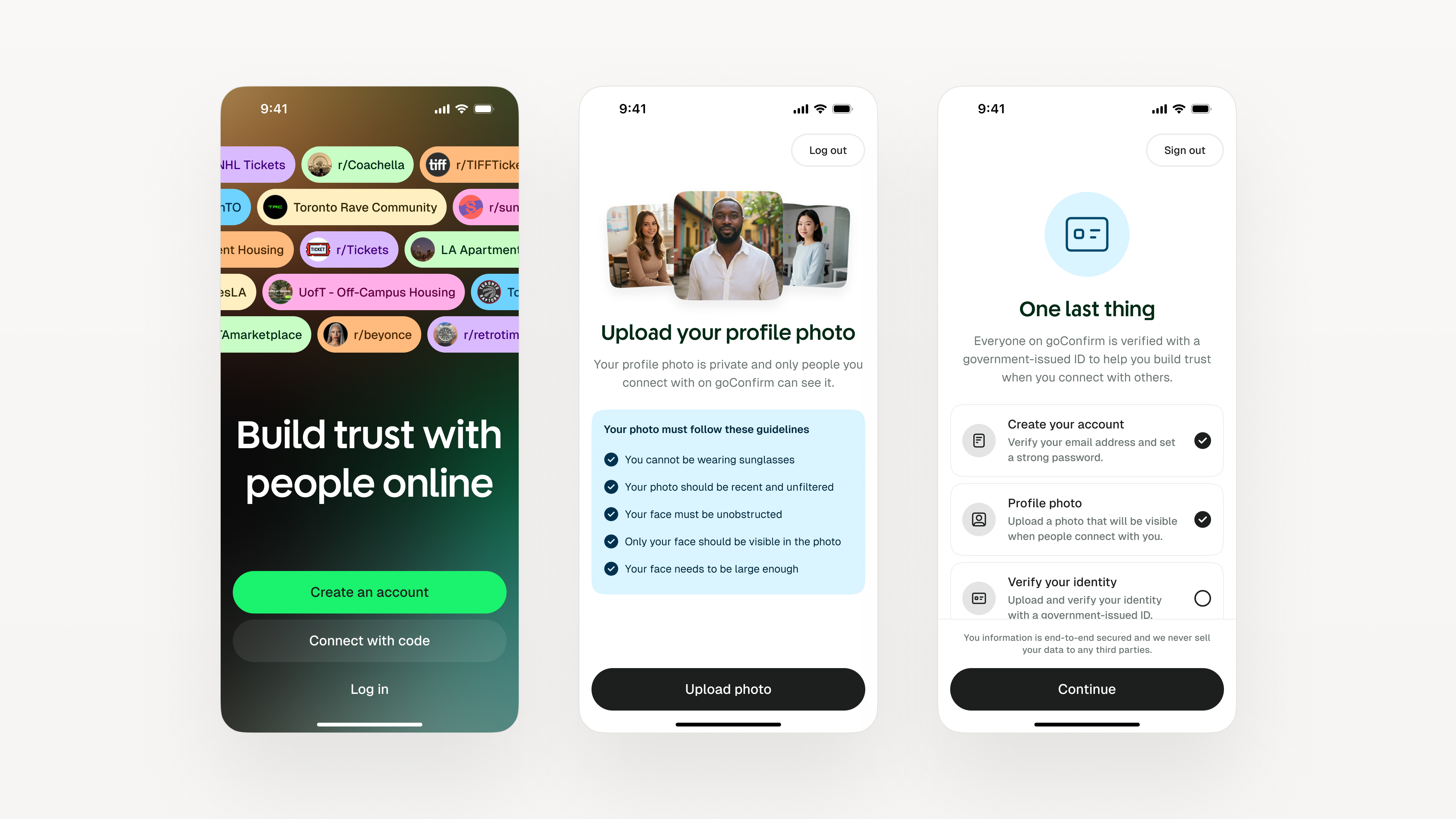
Onboarding
Asking consumers who may have never heard of you to sign up for your app by uploading photos of their driver's licence or passport and taking a selfie requires a lot of trust. For goConfirm's onboarding experience, we consistently experimented with a) the order in which information was requested, b) our choice of words, and c) what information was disclosed to the user and when.
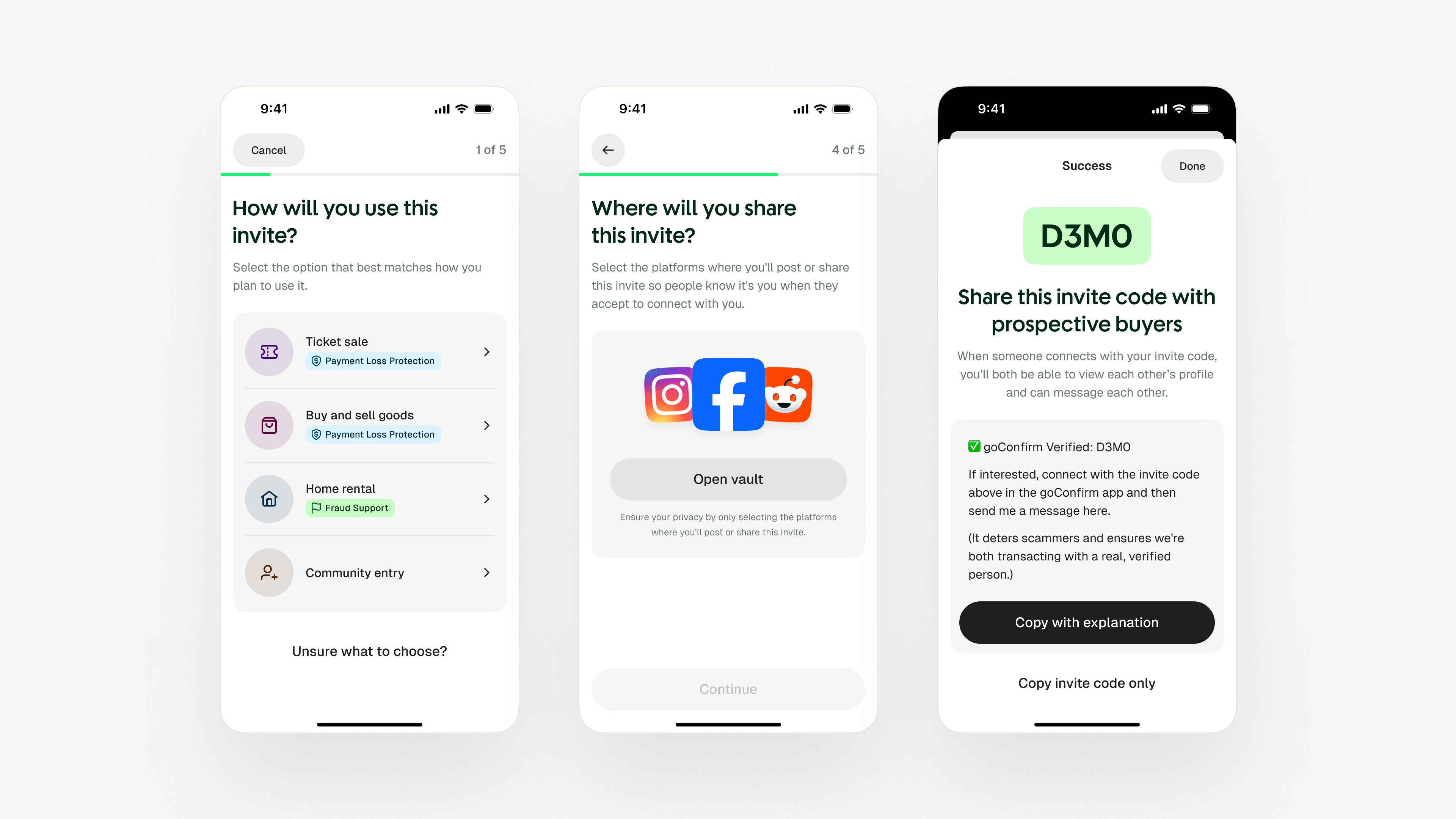
Invite Code Generation
When I first joined goConfirm, invite codes didn't exist. There used to be a single screen where a user could generate a "transaction code," which multiple people could connect with. However, for each person that connected with you, there would be a separate "transaction" created within which you could control "transaction details" that would only be visible for that specific individual.
This ended up causing a lot of confusion and made the app feel more like a "deal management app" than one that was specifically designed around creating trusted interactions with strangers online. I proposed the idea of shifting away from a single screen form to a multi-step invite code generation flow.
Depending on what the user selects in each step, the content and number of steps adjusted to reflect the user's desired outcome. This shift made it much more clear for users to understand what's going on when generating and sharing invite codes—name changed from transaction code to help the user understand that they need to invite someone with it.
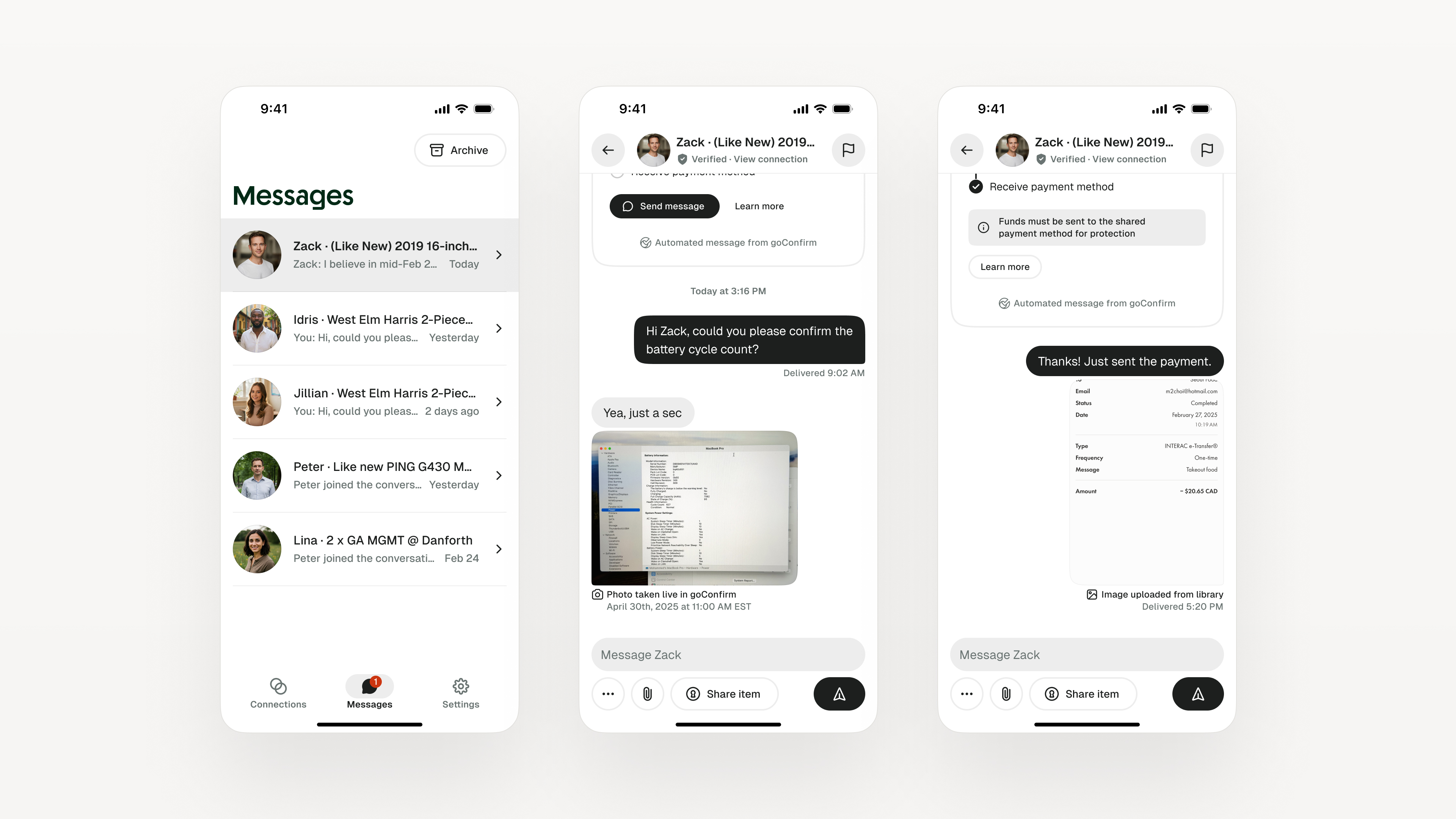
Messaging
The vast majority of our users were on Facebook and Reddit, both of which have their own messaging solution. Initially, we didn't think we needed to build messaging in our app, but we had to rethink this decision when we learned that:
- Some scammers were impersonating other buyers and sellers in these communities
- Users felt overwhelmed by the number of scammers messaging them on social networks, and
- Users loved that they could depend on our support team since they didn't feel they could rely on Facebook or Reddit the same way.
Once we started shipping Messaging, users told us that they thought anyone who refused to message them in goConfirm was a scammer by default. Users preferred using our messaging solution, even though it wasn't as robust as Facebook or Reddit, because they felt they could trust our service.
Over time, we added additional features such as:
- Automated system messages to help each connection move forward with their transaction based on actions taken in-app
- Timestamp for photos taken through the app so users receiving those photos can feel certain that it's legitimate
- Vault integration to make it easier for users to share their payment details and additional information
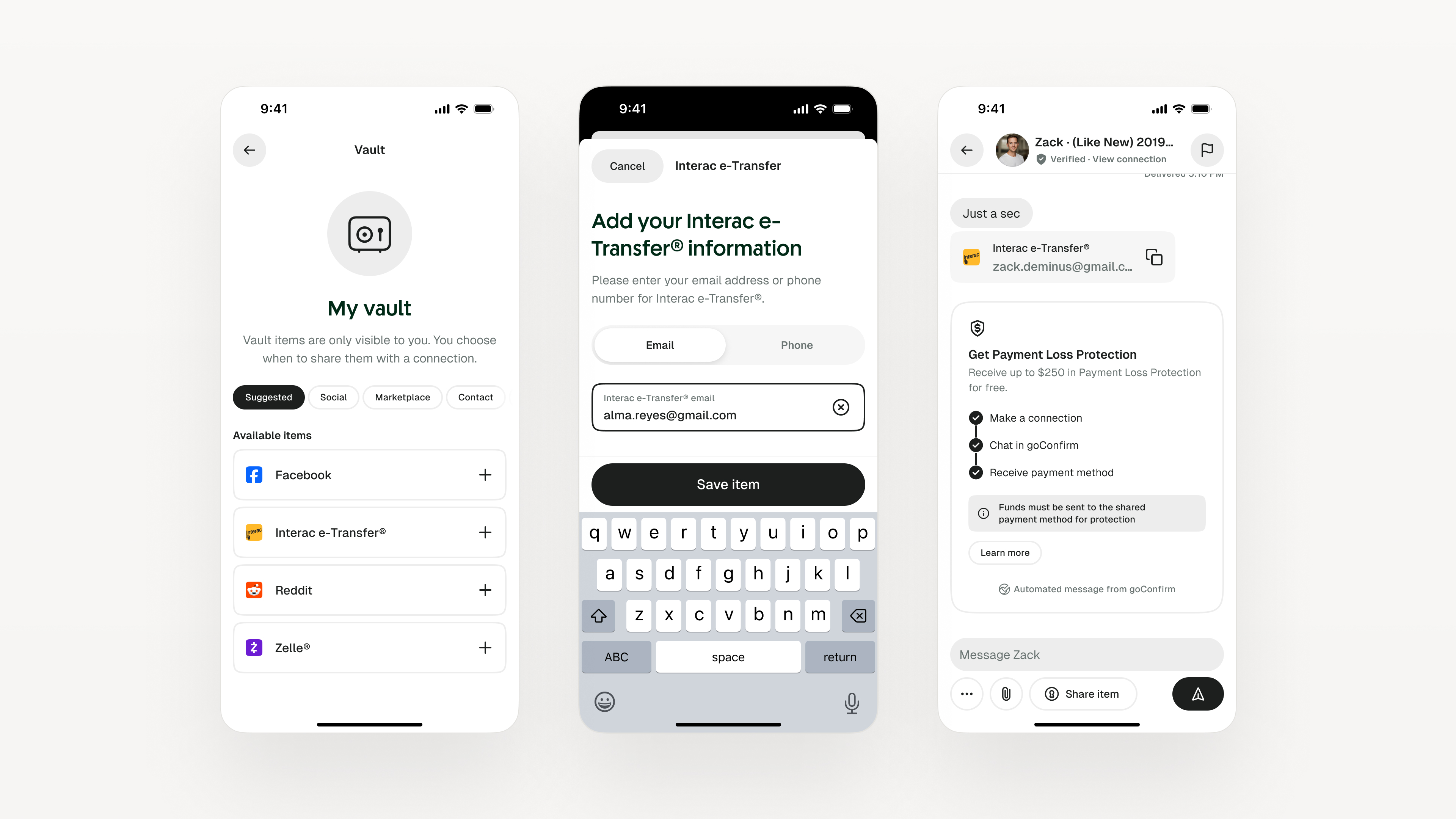
Vault
Through our user interviews, user testing, and user feedback for Messaging, we learned that we would need to equip sellers with an easy way share their payment information while ensuring buyers felt confident in the exchange. Of course, users can simply share their payment info by typing it out. However, we noticed it didn't always feel as trustworthy to some of the buyers.
We realized that part of the reason for this is because when users connected with each other, they could see the other person's social handles (including platform name) as means to signal where the person connecting found or saw the invite code. It felt "official" within the context of the goConfirm ecosystem, and not seeing payment information exchanged in a similar manner felt "unofficial."
With this in mind, we built the Vault to help users add and manage all of their platform information in one place. A key focus here was to afford us flexibility to add support for additional information in the future (e.g. marketplace, crypto, rentals, etc.) and ensuring it's easily accessible from across the app. This included integrating the Vault with the Connection flow, Connection screen, and Messaging.
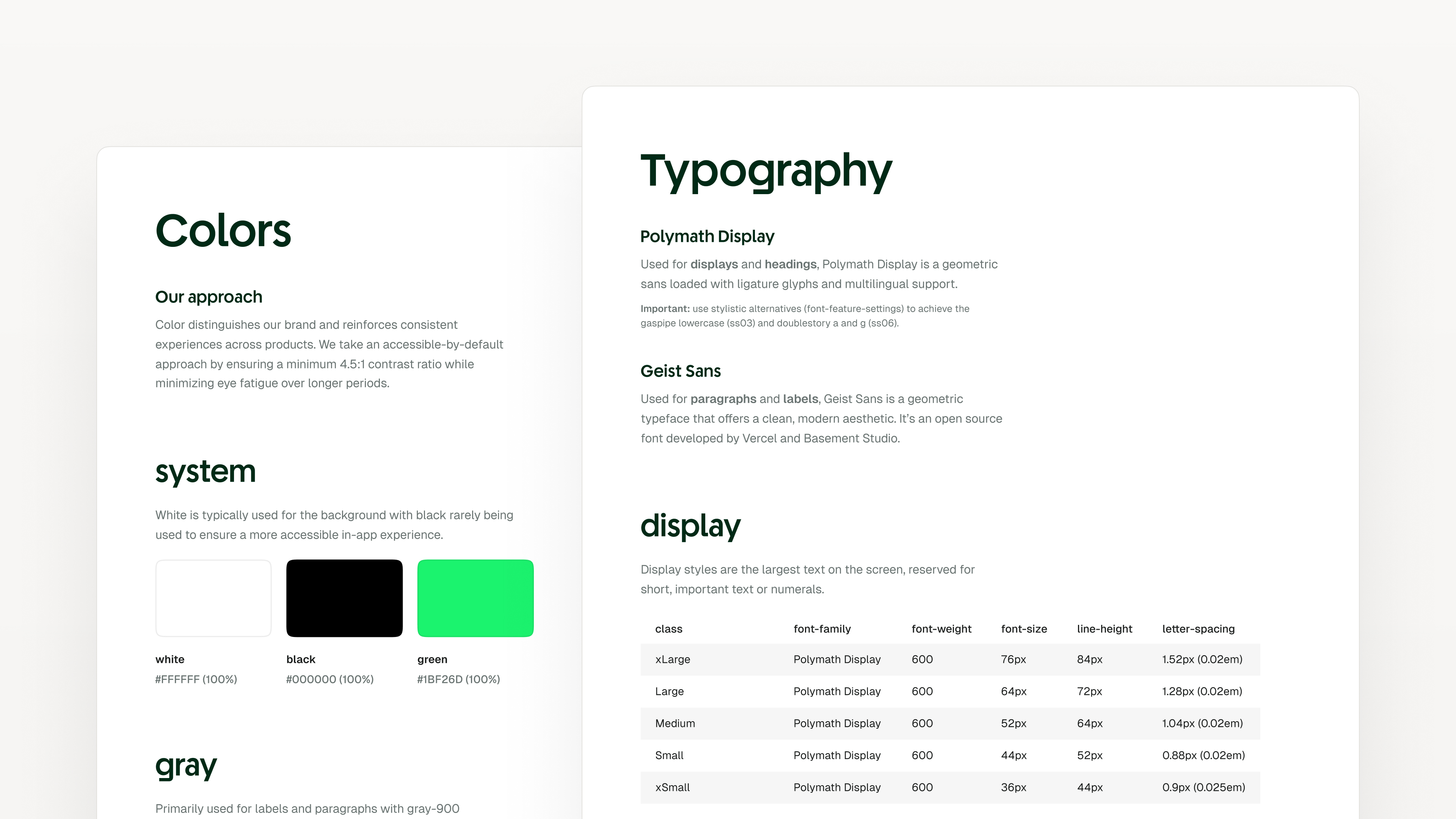
Design System
As part of our shift to reposition goConfirm as an "anti-scam app," we decided to rethink the whole user experience. This included the marketing website, mobile apps, and all email communications. While it wasn't a complete brand redo (we kept the existing symbol), I had to reimagine about 99% of it.
I believe the brand sets the promise, copy gives it a voice, motion adds energy, and product makes it usable. The best design systems weave these together into a single coherent voice. Whether users came across goConfirm on social media, our blogs, or the App Stores, it needed to feel unmistakably like the same brand.